Wednesday 30 April 2014
Tuesday 29 April 2014

Monday 28 April 2014
1. In what ways does your media product use, develop or challenge forms and conventions of real media products?
Planning and Research
In order to appeal to my target audience I realised that as well as making the music video my own, such as creating a new image for my artist and making the music video my own, I also acknowledged that appealing to my target audience is one of the most important factors in developing this music video campaign. Therefore, in order to do this, in my initial planning and research I looked into existing music videos of successful bands in the same genre. Although I wanted to follow certain conventions of form and genre (such as using a variety of frames and shots as well as editing to the beat of my song) I also wanted to challenge certain conventions of music videos in order to make my music video more unique, recognisable and and it also allowed me to create a strong profile for my artist.
Here is a Prezi explaining how I used/challenged forms and conventions of existing media products:
Specific examples of existing music videos that use conventions...
Another convention I followed in my music video was the use of effects in the post production editing process. There are many videos that do this:


I think this is a very effective thing to do in music videos, not to just to use a black and white effect but to use a variety of different effects in order to further reinforce the narrative of a music video.
Using certain conventions in my music video
So I decided to use this convention but in my own way by putting a 'dream like' effect on the shots of New York, in order to reinforce the idea that this is just a dream, an alternate reality that our star is dreaming of...

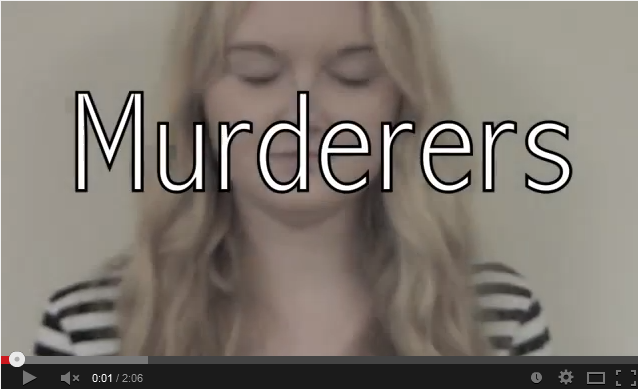 This was from my first draft, I have changed the font for the video titles in my newest draft, so it looks more conventional and also helps link with the text on my ancillary texts.


In order to appeal to my target audience I realised that as well as making the music video my own, such as creating a new image for my artist and making the music video my own, I also acknowledged that appealing to my target audience is one of the most important factors in developing this music video campaign. Therefore, in order to do this, in my initial planning and research I looked into existing music videos of successful bands in the same genre. Although I wanted to follow certain conventions of form and genre (such as using a variety of frames and shots as well as editing to the beat of my song) I also wanted to challenge certain conventions of music videos in order to make my music video more unique, recognisable and and it also allowed me to create a strong profile for my artist.
Here is a Prezi explaining how I used/challenged forms and conventions of existing media products:
Specific examples of existing music videos that use conventions...
Another convention I followed in my music video was the use of effects in the post production editing process. There are many videos that do this:
Using certain conventions in my music video
So I decided to use this convention but in my own way by putting a 'dream like' effect on the shots of New York, in order to reinforce the idea that this is just a dream, an alternate reality that our star is dreaming of...
I also used a variety of different camera shots in my music video as I noticed this was a convention of music videos and thought it would be a good convention to conform to to make my music video look effective. I used many different types of shots, including close ups, medium shots, long shots and extreme close ups...
This was from my first draft, I have changed the font for the video titles in my newest draft, so it looks more conventional and also helps link with the text on my ancillary texts.- Because the indie rock genre is known for breaking conventions of music videos (like the Kooks' video 'Always Where I Need To Be'), they break a lot of conventions of typical music videos, however, this means they are following conventions of indie rock music videos, which is something I have tried to do. For example, in The Kooks' video, they use a variety of different shots and locations (to create an almost montage feel about the video), this is something I liked when doing my initial planning and research and is something I have tried to apply to my music video.
- I also found a variety of conventions broken in indie rock music videos, so much so that challenging conventions of typical music videos has almost become a convention of indie rock music videos. For example, in Radiohead's Street Spirit video, it could be argued the video is pointless as it does not follow a clear narrative, however, it still has over 8 million views on YouTube, which may not seem a lot compared to a modern pop song video, however, if you take into consideration that the song came out almost 18 years ago and the video not long after it, it shows how popular this video must be, so that by creating an abstract video, your music video can still be popular, even if it does challenge conventions of 'typical' music videos.
- So in my video I used a variety of different locations in my video, in some audience feedback after my first draft I got feedback saying it appeared a bit too montage-y, and although this is something I wanted my video to do, I also didn't want this to be a negative factor of my video, so after receiving this feedback I changed a few things so it wasn't as repetitive and tried to create more of a clear narrative about it. However, I still wanted to challenge the convention that you have to have a set narrative in your music video, which is why it may still appear montage-y, but that is how I felt I could achieve my 'abstract' approach to my music video. My audience feedback allowed me to establish whether this was an effective way to approach my video.
- I also developed conventions in my ancillary texts, as well as my main music video. I decided to keep the design of my magazine advert and digipak fairly simple, which challenges conventions of digipaks/magazine adverts from other genres, however, in the indie rock genre it is not so challenging.
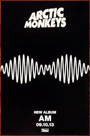
- For example, the Arctic Monkeys' latest album 'AM' is very simple, with not even a band name or album name on the front, I wanted to copy this style of design for mine, as this meant it would fit in with other indie rock magazine adverts/CD covers
Sunday 27 April 2014
2. How effective is the combination of your main product and ancillary texts?
My ancillary texts
Here is a Prezi, with an explanation behind my ancillary texts- why I chose the design, inspiration etc...
Audience Feedback on ancillary texts and main product:
To find out what my audience thought of my ancillary texts, as well as the combination of them with my main product I did some further audience research, including a questionnaire that I handed out to 10 people to find out how effective people thought my music video campaign was (the combination of the music video, the digipak and the magazine advertisement for the digipak). Here is the questionnaire:

In this section of my audience research I wanted to have a range of ages between around 16-25 and mixed genders, as this is my target audience, so I tried my best to do this. The youngest person I asked was 16 and the oldest was 21. Overall from this area of audience research I found that the simple design of my digipak was a popular choice, with some exceptions as people thought it "needed more going on", however, the majority of people were a fan of the design. I found that people preferred the digipak to the magazine advert as they found the repeated use of the same pattern on the magazine advert made it look too busy, but overall they thought it was an effective campaign.
Although people commented at the effectiveness of the combination of the ancillary texts together, there were a few comments on how well the video and the ancillary texts linked together. Some people commented on how they noticed the link in the video title font and the font used on the ancillary texts, however, the majority did say that it was hard to establish a proper link between the video and the ancillary texts. Although there was a general agreement that they could tell the video and the ancillary texts were both meant to be 'abstract'.
Creating my main product and ancillary texts
When creating my music video campaign, I wanted all 3 of my products to link together in some way, in order for my audience to establish the relationship between the 3. In order to do this I needed to create a housestyle between the products, this included using the same:
Here is a Prezi, with an explanation behind my ancillary texts- why I chose the design, inspiration etc...
Audience Feedback on ancillary texts and main product:
To find out what my audience thought of my ancillary texts, as well as the combination of them with my main product I did some further audience research, including a questionnaire that I handed out to 10 people to find out how effective people thought my music video campaign was (the combination of the music video, the digipak and the magazine advertisement for the digipak). Here is the questionnaire:
In this section of my audience research I wanted to have a range of ages between around 16-25 and mixed genders, as this is my target audience, so I tried my best to do this. The youngest person I asked was 16 and the oldest was 21. Overall from this area of audience research I found that the simple design of my digipak was a popular choice, with some exceptions as people thought it "needed more going on", however, the majority of people were a fan of the design. I found that people preferred the digipak to the magazine advert as they found the repeated use of the same pattern on the magazine advert made it look too busy, but overall they thought it was an effective campaign.
Although people commented at the effectiveness of the combination of the ancillary texts together, there were a few comments on how well the video and the ancillary texts linked together. Some people commented on how they noticed the link in the video title font and the font used on the ancillary texts, however, the majority did say that it was hard to establish a proper link between the video and the ancillary texts. Although there was a general agreement that they could tell the video and the ancillary texts were both meant to be 'abstract'.
Creating my main product and ancillary texts
When creating my music video campaign, I wanted all 3 of my products to link together in some way, in order for my audience to establish the relationship between the 3. In order to do this I needed to create a housestyle between the products, this included using the same:
- Fonts
- Props
- Colour schemes
- Pictures
That would then allow my audience to establish that the 3 products are related in my campaign. As the magazine advert is clearly an advert for the digipak and the digipak is featuring the music video, the link between these 3 is vital.
When it came to linking the digipak and the magazine advert, this was easy, the use of digital technologies such as Photoshop CS5 allowed me to use the same tools on the digipak and the magazine advert. For example, I used the brush tool on photoshop, and then by changing the shape of the brush to this:


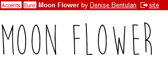 The website 'dafont.com' proved very useful in creating the house style between my two ancillary texts.

It meant that I could use both these tools, as well as the same colour scheme (I decided to go with purple and black as they went together well and I think these two colours fit in with the 'indie rock' scene).
The website 'dafont.com' proved very useful in creating the house style between my two ancillary texts.
I went on this website and used the font 'moon flower' on both my ancillary texts, and by using the same colour scheme and font it allowed me to effectively establish a link between the 2 products. I decided to chose the font because it is nice and simple, and in my initial planning and research when I looked the existing CD covers, I found that the most effective ones where the simpler ones that did not have too much detail on the front. This way it means the audience do not have too much to focus on and can focus on the name of the album and the artist, which is something that we want our audiences to remember, so that they will want to buy our products in the future.
Although I could not use this font in my video, as I could not find a way to import that font onto iMovie, I found a font that was almost very similar, so I used this for the video title of my video. I also kept the text simple on my video by putting 'Murderers' at the start of the beginning and 'Endless Daze' (the name of my artist) at the end, this meant that I have kept the design simple in both my ancillary texts and have tried to incorporate this into my music video.
When it came to my magazine advert for the digipak I found in planning and research that many successful artists when they have a magazine advert either have a picture of the artist or just a picture of the product on their magazine. I particularly liked the Arctic Monkey's 'AM' album magazine advert, as I thought the simplicity of it was very effective.
I decided to use this magazine advert as my inspiration for my magazine advert, by following the same conventions this one kept. I liked the way it does not focus on the image of the artist like some magazine adverts from different genres (specifically pop artists) do. By just having the name of the artist and album, the date the album is out and the design of the album on the magazine advert I think this looks very effective, especially for the indie rock genre.
I decided to challenge one of the conventions by having a bit more text on my magazine advert than the typical magazine advert, but still followed the convention of keeping the rest of the advert fairly simple. As you can see I featured the name of the artist and album, the date it is released and then a picture of the album (this is helpful for audiences because it means they know what to look out for). Because the design is simple yet unique to my artist, it has helped in the development of creating the new identity for my artist.
Saturday 26 April 2014
3. What have you learned from your audience feedback?
How I went about my audience feedback


In order to get a proper representation of what my target audience thought the final draft of my music video, I created questionnaires to hand out to a group of 10 people (of both genders and a variety of ages) in order to find out their opinions of my music videos, and any changes/improvements that they thought could be made to it. I decided to use a bigger sample for my final music video questionnaire because this is the most important video I have made, and so I wanted to get a larger sample in order to get a truer representation of what my audience thought of my video.
The Questionnaire:

The Results:


From these results I found that overall people from my sample audience enjoyed the video. Although certain people commented that it was not the genre of music they listened to, I thought my video was quite successful among them nevertheless. Some commented on the overall quality of the footage with some responded to the question "Do you think the overall quality of the footage is good?" with:
"In some parts yes, some are a bit unfocused
and
"Sometimes is a bit blurry, but some is good"
From these comments in particular I have learnt that my footage was not the best possible quality it could be, mostly due to the rushing of the filming. However, there were also some positive comments on my video. For example, with quite a few people commenting on how they liked the use of the taxis and the subways in my video, and one person replied to the question: "Do you think the camera movements/frames/shots go with the beat of the music?" with "yeah it flowed quite well".
Overall from this questionnaire I have learnt that people did enjoy watching my video and have pointed out specific bits that they especially enjoyed watching, however, I have also learnt that if I were to do my video again I would need to make the overall quality of the footage a lot better in order to try and make it look like a 'conventional' music video and to make it more successful among my target audience.
Overall What I Have Learnt From My Audience Research...
Doing the audience research for both my first and final draft was very useful in the production of both videos. After gaining feedback from my first draft it made me aware of what to change to make my video more effective and enjoyable for my audience to watch. It also made me realise certain areas of my video that were very poor and needed changing. For example, the footage of the Statue of Liberty was horizontal, which did not look good, and the zoom on it was very shakey as it was handheld camera. So when it came to making the next draft of my video I decided to get rid of the footage, as I realised it was not something that looked like a conventional shot in a music video and is not something my audience would enjoy watching.
I also noted that the overall quality of my footage was not as good as it should/could be, however, this was one aspect of the video that would have been very difficult for me to change without changing the whole of the video as it would have meant starting my filming all over again as I would not have been able to go back to New York to film. However, I did my best to improve the quality by getting rid of certain scenes that were just very poor quality (as mentioned above) and by repeating some of the footage (in different ways though so it does not look too repetitive).

- I got audience feedback from both my final draft as well as my first draft of my music video, to find out what people thought of the first draft and then what they thought of the final music video.
- The feedback from my first draft allowed me to see what changes I needed to make in order to make my final music video more successful and effective.
- Here are the questions that I asked to a group of 5 random people from my target audience age range:
Age:
What do you think of the footage so far?
Do you think it is interesting to watch?
Would you watch it again?
What areas would you improve, and why?
In order to get a proper representation of what my target audience thought the final draft of my music video, I created questionnaires to hand out to a group of 10 people (of both genders and a variety of ages) in order to find out their opinions of my music videos, and any changes/improvements that they thought could be made to it. I decided to use a bigger sample for my final music video questionnaire because this is the most important video I have made, and so I wanted to get a larger sample in order to get a truer representation of what my audience thought of my video.
The Questionnaire:
The Results:
From these results I found that overall people from my sample audience enjoyed the video. Although certain people commented that it was not the genre of music they listened to, I thought my video was quite successful among them nevertheless. Some commented on the overall quality of the footage with some responded to the question "Do you think the overall quality of the footage is good?" with:
"In some parts yes, some are a bit unfocused
and
"Sometimes is a bit blurry, but some is good"
From these comments in particular I have learnt that my footage was not the best possible quality it could be, mostly due to the rushing of the filming. However, there were also some positive comments on my video. For example, with quite a few people commenting on how they liked the use of the taxis and the subways in my video, and one person replied to the question: "Do you think the camera movements/frames/shots go with the beat of the music?" with "yeah it flowed quite well".
Overall from this questionnaire I have learnt that people did enjoy watching my video and have pointed out specific bits that they especially enjoyed watching, however, I have also learnt that if I were to do my video again I would need to make the overall quality of the footage a lot better in order to try and make it look like a 'conventional' music video and to make it more successful among my target audience.
Overall What I Have Learnt From My Audience Research...
Doing the audience research for both my first and final draft was very useful in the production of both videos. After gaining feedback from my first draft it made me aware of what to change to make my video more effective and enjoyable for my audience to watch. It also made me realise certain areas of my video that were very poor and needed changing. For example, the footage of the Statue of Liberty was horizontal, which did not look good, and the zoom on it was very shakey as it was handheld camera. So when it came to making the next draft of my video I decided to get rid of the footage, as I realised it was not something that looked like a conventional shot in a music video and is not something my audience would enjoy watching.
I also noted that the overall quality of my footage was not as good as it should/could be, however, this was one aspect of the video that would have been very difficult for me to change without changing the whole of the video as it would have meant starting my filming all over again as I would not have been able to go back to New York to film. However, I did my best to improve the quality by getting rid of certain scenes that were just very poor quality (as mentioned above) and by repeating some of the footage (in different ways though so it does not look too repetitive).
Friday 25 April 2014
4. How did you use media technologies in the construction and research, planning and evaluation stages?
List of technologies used:
- Social Media
- Blogger- helped a great deal in the organisation and layout of my work, in all of the stages of production. It allowed me to update my work, and write a planning process for the production of my video. It allowed me to keep track of the work I had already done, as well as look back at the brief to see if I was still meeting it. Blogger is also very useful as it allows you to embed links to videos, presentations, Prezis as well as feature pictures, that I could scan in or get off the internet.
- YouTube
- Google- this played an important role in the research stage of my music video as it allowed me to access loads of different sites/information about different bands and music videos I was researching.
- DaFont- this is a website that features lots of different fonts that are free to use. I used this for my ancillary texts as I found the fonts featured on Photoshop were not really eye catching for my ancillary texts. I used a font called 'Moon Flower' on both the digipak and the magazine advert, which helped create a house style for both my ancillarys and allow my audience to establish the connection between the two.
- Other technologies:
- Camera (Nikon L120 and Sony Handycam HD)
- Macbook Pro (for editing and some evaluation and research and planning)
- iMovie (for editing first draft)
- Photoshop CS5 (for ancillary texts)
- Video Camera on iPhone (for filming audience feedback)
- Mircrosoft Word- was particularly useful in producing the questionnaires for my audience feedback
Below is a Prezi with an outline of all the technologies I used in all stages of creating my final product, as well as the ancillary texts, with an explanation of why they were useful and the effect they had on my final product:
Friday 28 March 2014
A new draft...
Here is another rough draft of my music video where I have added some new scenes, such as the opening and closing scenes of the girl, and added text- as I found this was a convention of music videos. I also deleted some scenes that I realised did not look conventional for a music video, and have noted where I need to add and change some more things. Including the font on the video title because I realised this does not look very professional or conventional and have decided to use a better font on my final draft, and a font that my audience can associate with the ancillary texts.
Subscribe to:
Posts (Atom)